Infographics are all the rage.
Our brains like them because they are more engaging and easier to process.
Often, we can more quickly comprehend the meaning or message in an image than in lines of text.
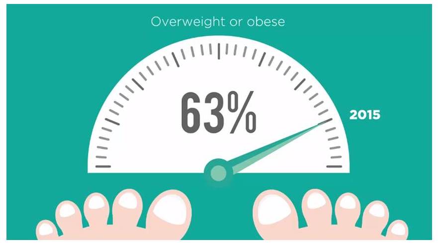
For example, take a look at the image above.
Now read the text below:
In 2015, the proportion of adults who are overweight or obese is 63 per cent.
Which one was easier to digest (no pun intended)?
Visuals can also be more persuasive and easier to recall.
Find out more about 13 reasons why our brains crave infographics.
While their simplicity might be one of the reasons we like and share infographics, they’re not necessarily simple to produce.
Especially animated infographics.
A fair bit of work goes on behind the scenes to understand and distil all the relevant information, come up with appropriate and creative concepts, script and animate.
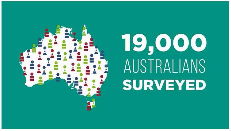
Of course it helps if you have clever colleagues, like my friends at Spectrum Graphics, who asked me to work with them to script this little animated infographic they produced for the Australian Bureau of Statistics, to highlight the 2014–15 National Health Survey results.
http://www.abs.gov.au/ausstats/abs@.nsf/mf/4364.0.55.001
| Cinden Lester has more than 25 years’ experience as a professional writer, editor and communications specialist. She worked as a broadcast journalist, in private sector marketing and public relations, and in government communications before establishing her own Canberra-based communications consultancy in 2000.
Contact Cinden if you’d like help with your communications. |