The way your words are presented can be just as important as the words themselves. Good typography enhances readability and understanding, and supports your overall branding.
Not-so-good typography can be distracting, hard to read and at odds with your message and brand ‘personality’. So what exactly is good typography?
Friend and graphic designer, Alex Godfrey from Fusebox Design, explains in this guest article.
Flickr / johnrabbit
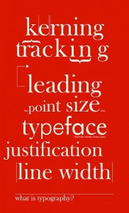
What is typography?
Typography is the art and technique of arranging type – the use of typefaces, type sizes and spacing. It’s central to a graphic designer’s work and skills, and a specialised field in its own right.
Typography is an essential ingredient for good, effective communication. Typography conveys an image, sets a tone, and gives voice and personality to your words. It helps you capture your readers’ attention and influences whether they remain engaged, or whether they surrender to other distractions.
It matters to everyone these days – not just designers – because we all work with text on a page or a screen, and because the demands on our time and attention are exhausting.
We learn to read by recognising individual letters, but as we get better at it we skim lines of text much faster and identify words as shapes. This is known as the saccadic rhythm of eye movement.
Features like bold, italic, underlines, capital letters and colours upset the saccadic rhythm and give the eye a jolt. Too many jolts and our eyes (and minds) get tired and give up.
You’ll know it when you don’t see it. I was once advised that if someone notices your typeface, you’ve failed. Your readers won’t notice when it’s good, but they’ll certainly notice if it’s bad.
Here are some key typography rules from Butterick’s Practical Typography:
- The body text sets the typographic quality or tone of your page.
- Point size should be comfortable (for word processing, that’s 10–12 points on the page or 15–25 pixels on screen).
- Line spacing should be 120–145 per cent of the point size.
- Line length should be 45–90 characters.
- Choose a professional typeface and avoid goofy or overly decorative ones.
- Never use underlining.
- Use bold and italic as little as possible.
- Learn to use tabs instead of making multiple spaces with your space bar.
- Turn your kerning on if your word processor has that feature (it makes small adjustments to the spaces between letters so they work better together).
- Use non-breaking spaces to avoid words separating over a line break (for example a number and its unit).
The typeface FF Meta was designed by Erik Spiekermann in 1985 to look good when reproduced poorly and at small sizes. Its letterforms needed to be condensed to save space, have strokes thick enough to withstand bad printing, but avoid individual characters running together. It’s no surprise that Meta has been used the world over in telephone books.
When type is very large (think large-scale signage) the letter spacing always need tweaking. Designers spend a lot of time sculpting large type to get the most pleasing effect from the shape of the words.
Different typography styles suit different audiences and markets. A heavy metal band doesn’t speak to its audience in the neutral Helvetica typeface. Instead, they’ll use a more-difficult-to-read Gothic font because it is part of their culture. Particular audiences happily overlook legibility for a certain aesthetic expectation.
Web pages offer a feast of appealing distractions for the eye: numerous menu options, pop-up boxes, images, videos, social media icons and, of course, underlined hyperlinks. These underlined links upset the saccadic rhythm and give readers an easy route to abandon text that doesn’t grab them. It’s tougher than ever to keep your readers with you online.
Typography is evolving for screen applications today, just as it did in the 15th century when the printing press was the new technology. Elegant, classic typefaces for the printed page can now be too subtle for the screen, where slightly thicker forms often work well. Google Fonts offers Open Source fonts designed to make the on‑screen experience more pleasant. Web designers can code these into your page.
As computer screens like Apple’s Retina displays continue to offer even better resolution, guidelines on what works best on screen will probably change again soon.
Never underestimate the ‘less is more’ rule. A life drawing class is a better place to show your artistic flair than by experimenting with the type on your page. Keep your pages neat, clear and simple to keep your readers with you.
Alex is the Communications Director at Fusebox Design.
Do you have a project that needs expert writing and graphic design? Contact Cinden for help with your next project.
| Cinden Lester has more than 25 years’ experience as a professional writer, editor and communications strategist. She worked as a broadcast journalist, in private sector marketing and public relations, and in government communications before establishing her own Canberra-based communications consultancy. |