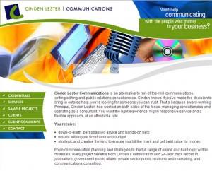
 There’s retro, classic and vintage. Then there’s just plain old… well, old. My 12-year-old website was almost retro but in reality it wasn’t ageing that gracefully. So, time for an update.
When you make your living helping people communicate effectively – including writing and revamping websites – updating your own should be a piece of cake, right? Well, not quite.
It’s actually quite challenging to be objective about your own material (which, as it turns out, is one of the advantages of working with a consultant).
Here are three lessons learnt when updating my site that might be helpful for your next website project.
1. Revisit the basics
It’s easy to get caught up in the window dressing (the design, colours, bells and whistles) but it’s important to also revisit the basics:
- Your business plan and communications plan. How does your website fit into your overall planning? Do your plans need updating? Are you are clear on your goals and on track to achieve them? What else are you doing that provides opportunities for cross-promotion, especially to help drive people to your site?
- Your branding. Ideally your branding encapsulates your organisation’s personality as articulated in your vision, mission, values and the way you work. Does your branding need updating and how can it be integrated into the look and feel of your website?
- Your website’s main purpose and audience. Are you aiming to inform, report, promote, persuade, sell? Understanding this will help you determine the most appropriate language and style and the most effective way to present your content.
- Your technical requirements. How do you want to manage your site and update your content, and how can you set up your site to accommodate your short and longer-term needs?
2. It’s all about shoes (someone else’s)
It’s hard to be objective about subject matter you are very close to or have worked on for a long time. It can especially hard to write about yourself.
It helps to step into your audiences’ shoes. Ask yourself what’s in it for them – in other words, what matters to the people who matter to your business? What do they want or need to know? What problems can you help them solve and how does this benefit them? This helps you to step back from what is important to you and focus instead on what is important to your audience. It also helps you use the right language and style to engage your audience.
3. Testing, testing…
The wannabe graphic designer in me always enjoys dipping into the creative side of things. I have pages of doodles, diagrams, illustrations and squiggles. So when updating my logo as part of my website refresh project, I had some pretty clear ideas (well, squiggles anyway) for my designer to work with. But I also had a few niggling doubts. What if people liked my old logo better? Was I sure about the new look? Did it communicate the right branding and messages?
Light bulb: test the options with my audience. Getting audience feedback is more useful than second-guessing or basing decisions solely on your own subjective point of view. And in my case, the feedback was in sync with my own thinking, which was reassuring.
The same goes for your website. Audience feedback helps ensure you are on the right track and can keep making improvements.
Are you updating or establishing a website? Contact Cinden for help with your next project.
| Cinden Lester has worked on numerous government and private sector websites. A particular skill is reviewing existing sites that have grown and become cumbersome over time, to advise on improved structure, content, language and style. |
